Climate change: In visual graphics
It is “very likely” that human activity is the cause for climate change, scientists from over 130 countries have concluded. The graphics below illustrate their predictions on just how much global temperatures may rise over the next century.
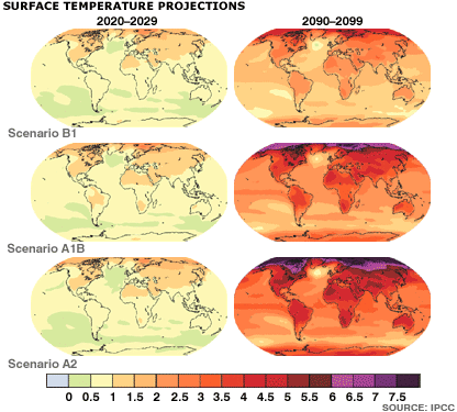
The Intergovernmental Panel on Climate Change predicts that temperatures are most likely to rise by 1.8C-4C by 2100. But the possible range is much greater; 1.1C-6.4C. The maps above show how a range of three different scenarios will affect different parts of the planet.
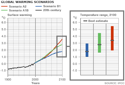
The emissions scenarios, A1B, A2, B1, used to create the maps above, are based on a range of detailed economic and technological data. These versions of the future consider different population increases, fossil and alternative fuel use, and consequent CO2 increases. The broad range of outcomes they show is displayed in the charts below.
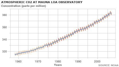
Carbon dioxide is the main greenhouse gas, its rise since the industrial revolution is clear. Burning coal, using oil and deforestation all place CO2 into the atmosphere.
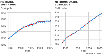
The other two main greenhouse gases are methane and nitrous oxide. Both gases have a much smaller presence in the atmosphere than CO2 but are much stronger greenhouse gases; methane has over 20 times the effect of C02, while nitrous oxide is nearly 300 times stronger.
Climate forecast
In 2001, scientists predicted the Earth would warm by 1.4 - 5.8C by 2100. Most of the warming, they believed, was a result of humanity’s use of fossil fuels, like oil and coal. The scenarios (right) compare a fossil-fuel driven future with one where sustainable development is a priority.
To view read more about the climate change and to see more about its impact on our climate please visit the BBC’s website.

The Intergovernmental Panel on Climate Change predicts that temperatures are most likely to rise by 1.8C-4C by 2100. But the possible range is much greater; 1.1C-6.4C. The maps above show how a range of three different scenarios will affect different parts of the planet.
The emissions scenarios, A1B, A2, B1, used to create the maps above, are based on a range of detailed economic and technological data. These versions of the future consider different population increases, fossil and alternative fuel use, and consequent CO2 increases. The broad range of outcomes they show is displayed in the charts below.


Carbon dioxide is the main greenhouse gas, its rise since the industrial revolution is clear. Burning coal, using oil and deforestation all place CO2 into the atmosphere.

The other two main greenhouse gases are methane and nitrous oxide. Both gases have a much smaller presence in the atmosphere than CO2 but are much stronger greenhouse gases; methane has over 20 times the effect of C02, while nitrous oxide is nearly 300 times stronger.
Climate forecast
In 2001, scientists predicted the Earth would warm by 1.4 - 5.8C by 2100. Most of the warming, they believed, was a result of humanity’s use of fossil fuels, like oil and coal. The scenarios (right) compare a fossil-fuel driven future with one where sustainable development is a priority.
To view read more about the climate change and to see more about its impact on our climate please visit the BBC’s website.
You can return to the main Market News page, or press the Back button on your browser.

